| ||
Client NewsIn this blog we cover general internet news, trends, and how-to's of interest to our clients.
Recent Entries
«Return to Main Blog PageThis is What a Responsive Website Looks Like March 9, 2015
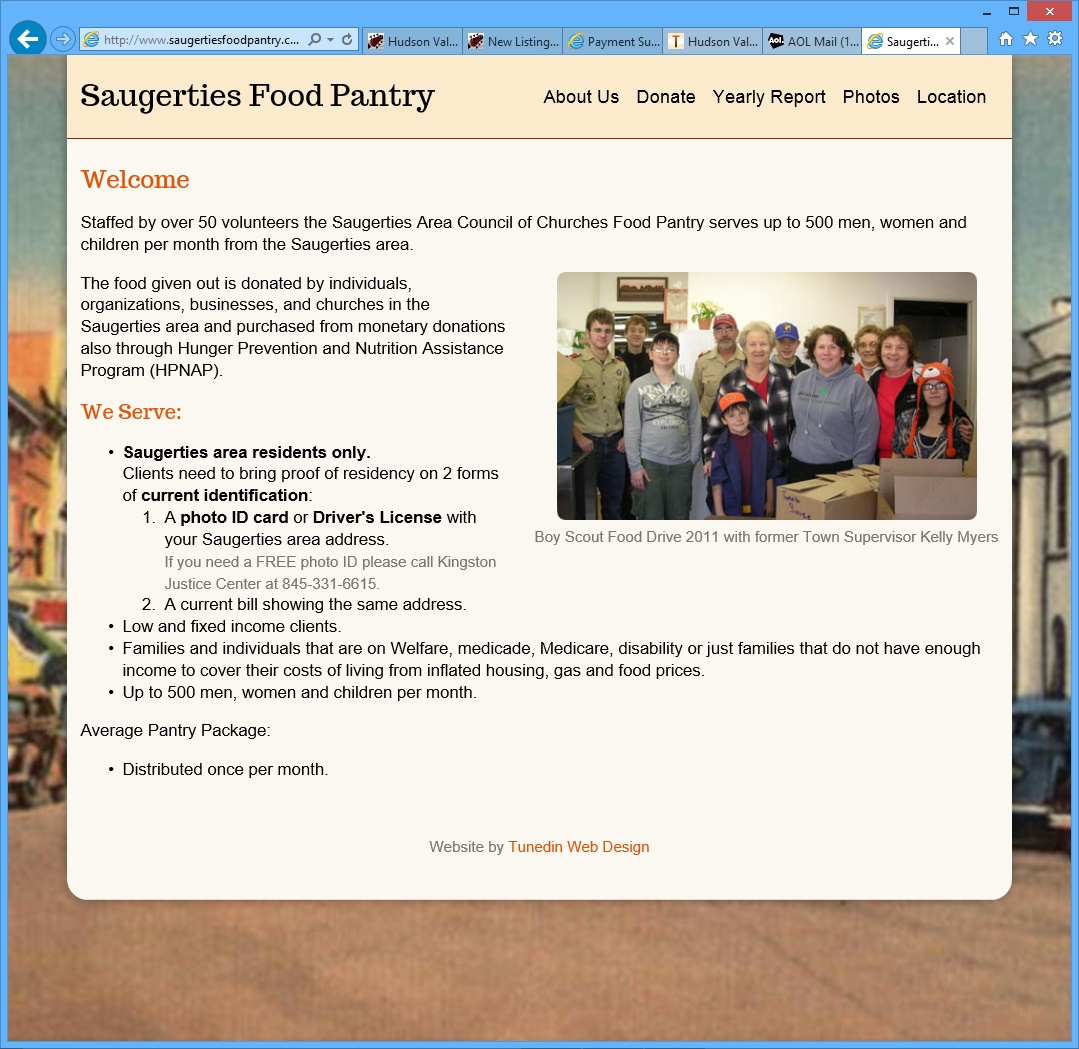
"Responsive" websites are designed as a single site that displays well on all types of devices -- desktop browsers, tablets, and smart phones. Responsive sites adapt themselves to the size of screen the user has in order to display well on that screen. They are a good choice for clients who primarily need a mobile website, and where support for tablets or browser is needed but secondary. We have recently build a fully responsive website for a Hudson Valley client -- The Saugerties Food Pantry. This client needed primarily a mobile site to serve it's clients, who would be accessing the site mostly via mobile devices. This is a very simple website, so it's a good example to use to see the elements of the design that respond to the screen size.
 Website as seen on a desktop browser. Website as seen on a desktop browser.
We started with a "mobile-first" design approach. This is where we design the site for mobile, and then add on support for tablets and desktop browsers -- quite different than the "normal" approach of designing the desktop website and then adapting it to mobile. You'll notice that the mobile version contains the most essential information, with progressively more information being added to the tablet and browser versions. The mobile and tablet versions use these design principles:
For more information on mobile websites, read my blog series "Mobile and You", and contact us to talk about a mobile website that fits your needs.
| ||
|